Grand + Nash
SteelWave
Where work comes to life, and life comes to work.
website
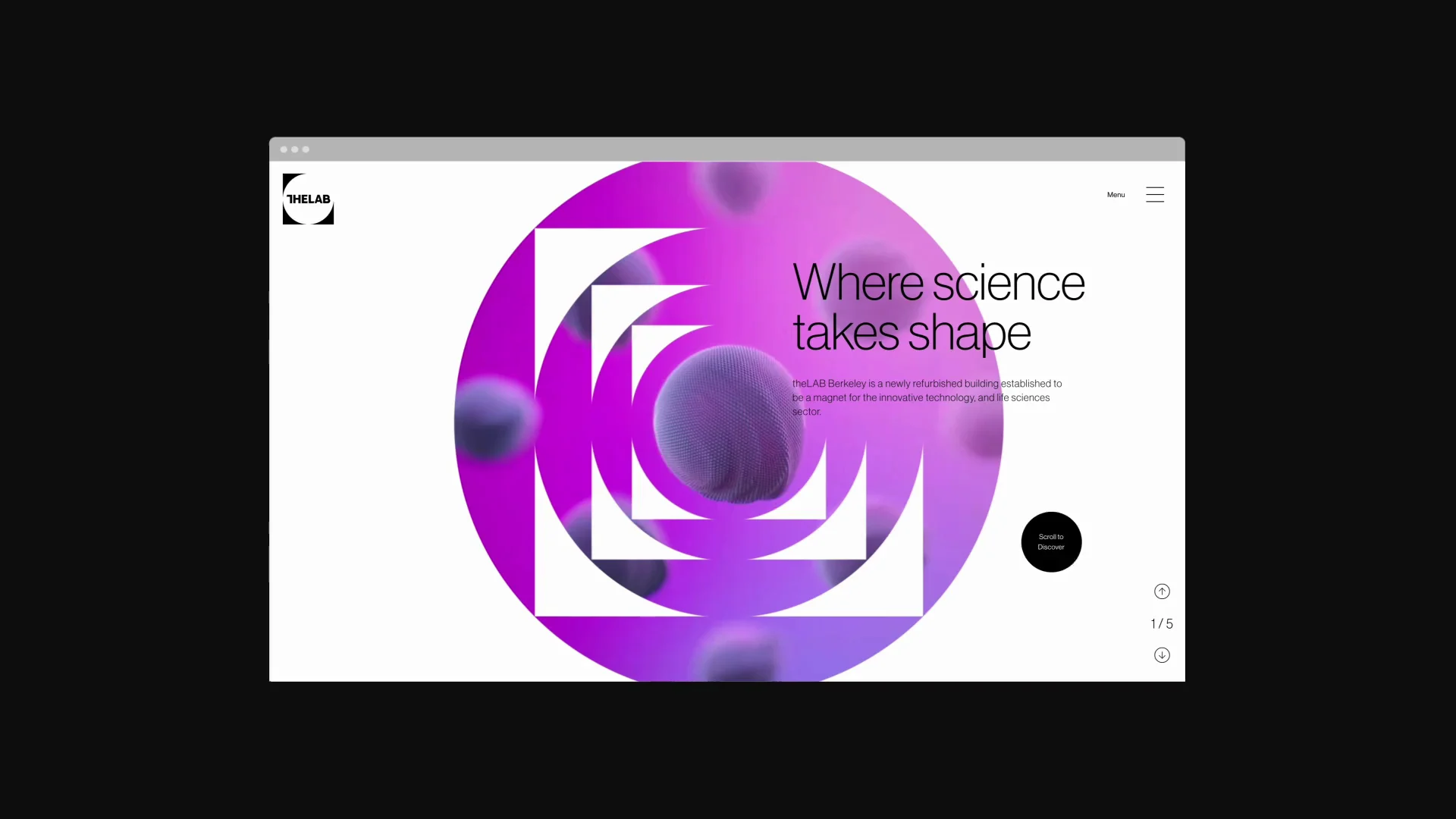
Real estate developer SteelWave approached Haus to create the branding and web presence for its new property—Grand + Nash. The renovated creative workplace blends enriching greenspace with the conveniences of a future-forward office campus.
Brand design
Where nature meets technology
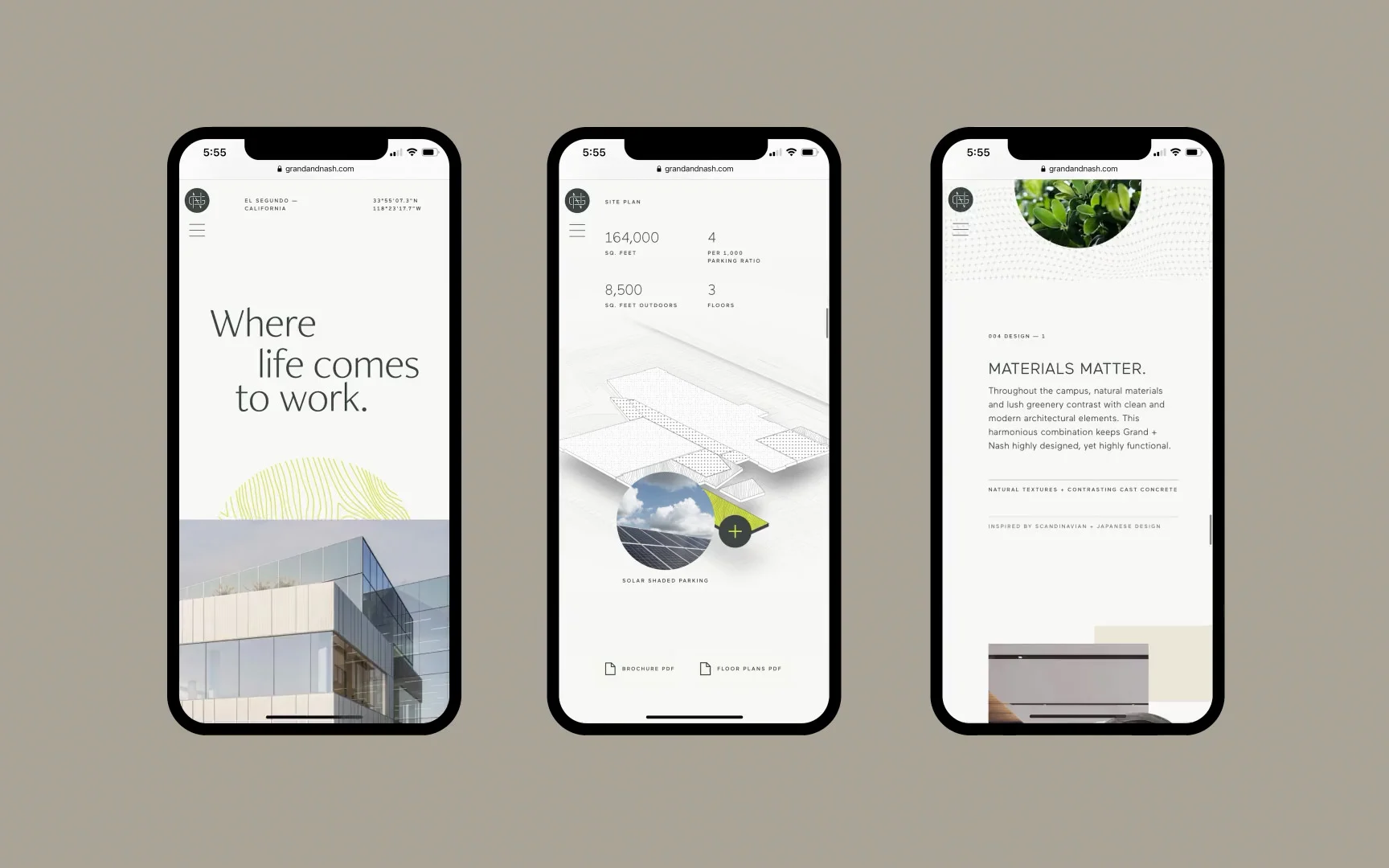
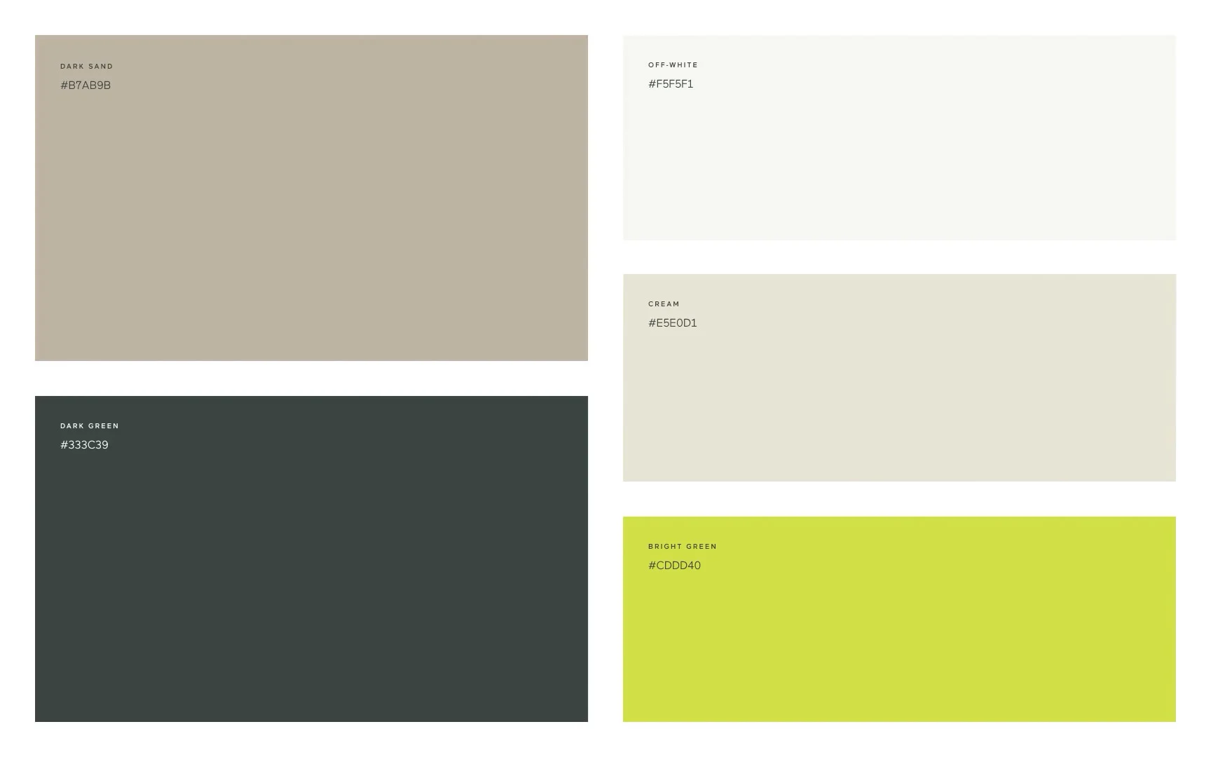
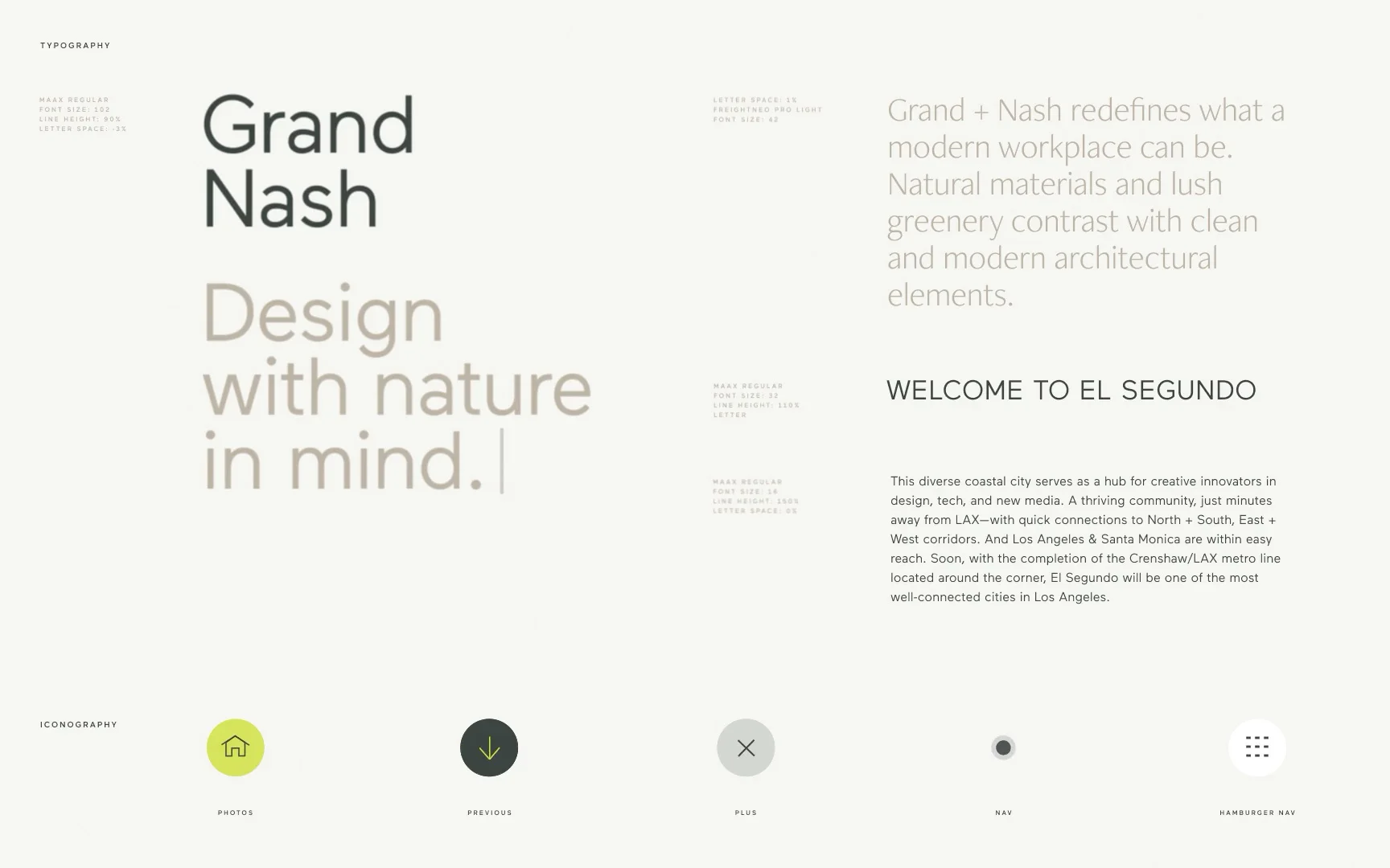
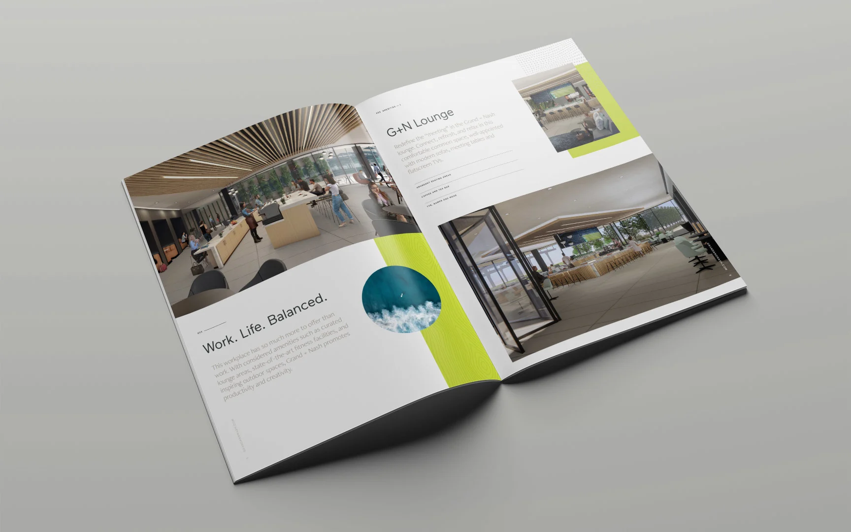
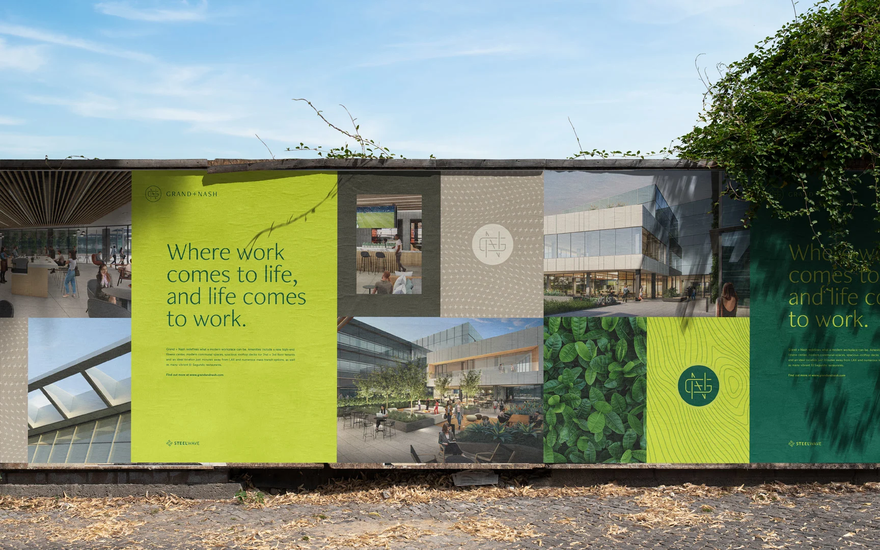
Haus created a modern design system for Grand + Nash that embodies the rich blend of natural and manmade textures found throughout the building itself. The logo features a simple monogram that represents the streets joining at the campus location. Through typography, color and pattern, we placed an emphasis on movement and growth, drawing parallels between the dynamics of the abundant foliage and modern architecture.
An immersive website
A seamless flow
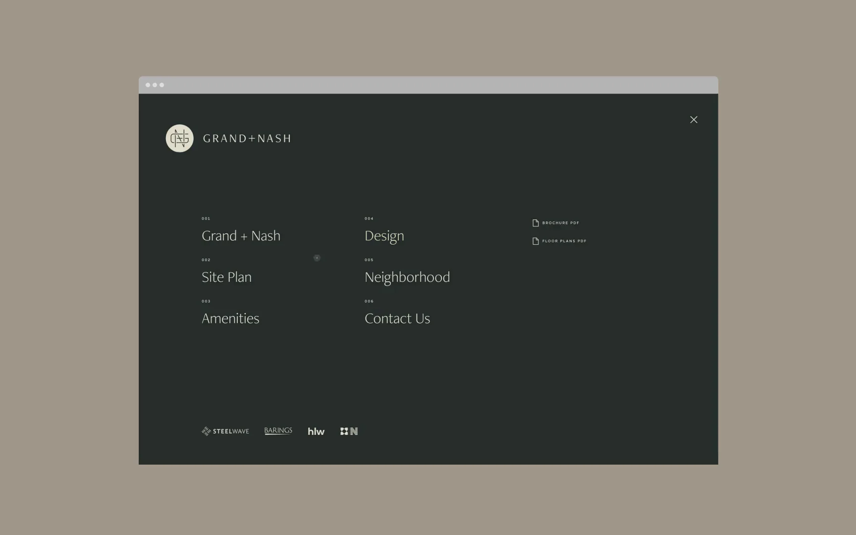
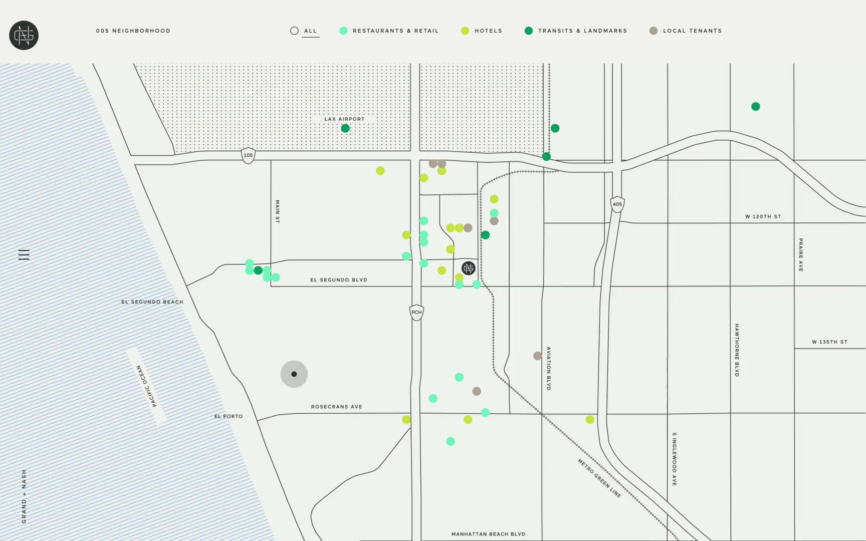
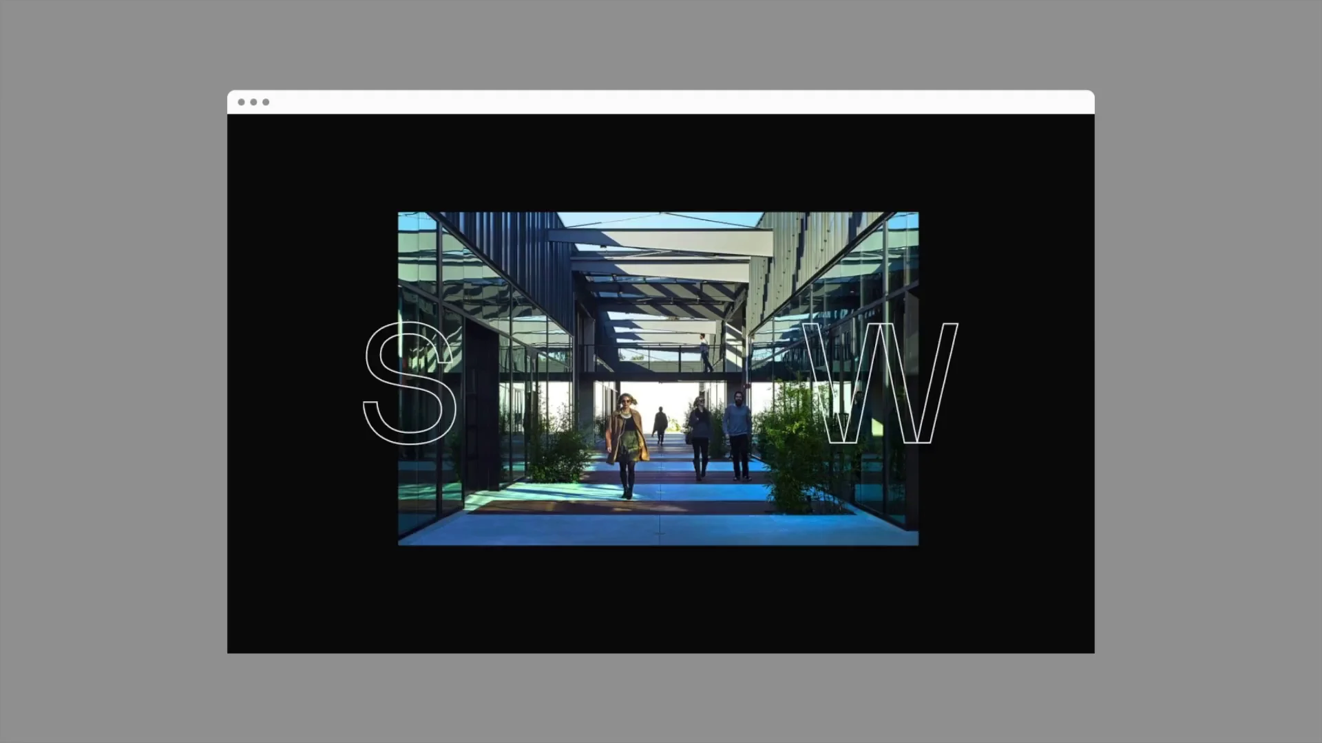
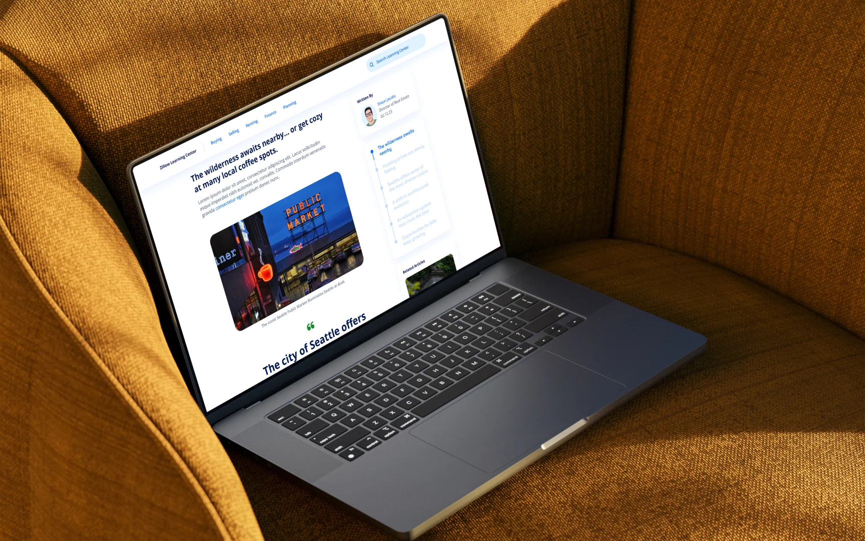
We produced a responsive tour of Grand + Nash that goes far beyond the floorplan. Utilizing a long scroll format with a flowing parallax, we guided the user through the highlights of the property, featuring high-impact renders of what it will look like. With multiple galleries and an interactive site plan, users can easily explore the amenities of the space then dive deeper into the inspiration behind it. The modern workplace has to be more than just work, so our interactive map shares the highlights of the neighborhood.
