Mailchimp
Mailchimp
What do Moby, monkeys and mornings have in common?
Video
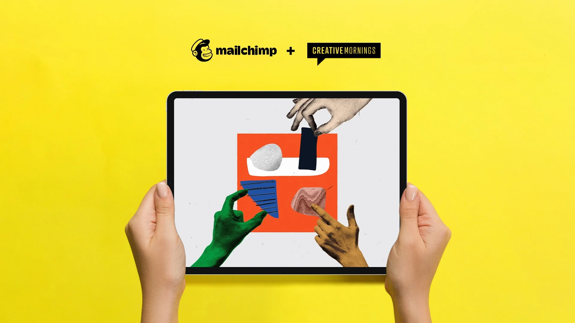
MailChimp and partner CreativeMornings approached Haus to create fun, colorful animated "Takeaways" that provide viewers with bite-sized recaps of longer "TED talk" style lectures.
Going down?
Permission to fail
To create a consistent narrative from several hours worth of lecture material, we constructed an audio-only edit featuring the experience of three very different creative professionals (from very different disciplines) but with a common thread–each had experienced the liberating power of failure. We then created rough boards that blocked out story beats illustrating the main elements and themes from the narrative. We knew that to convey the positive impact of failure meant that we needed to find a visual language that could tell an emotional story in a concise, lighthearted way.



Graphic style
Stylized animations with real heart
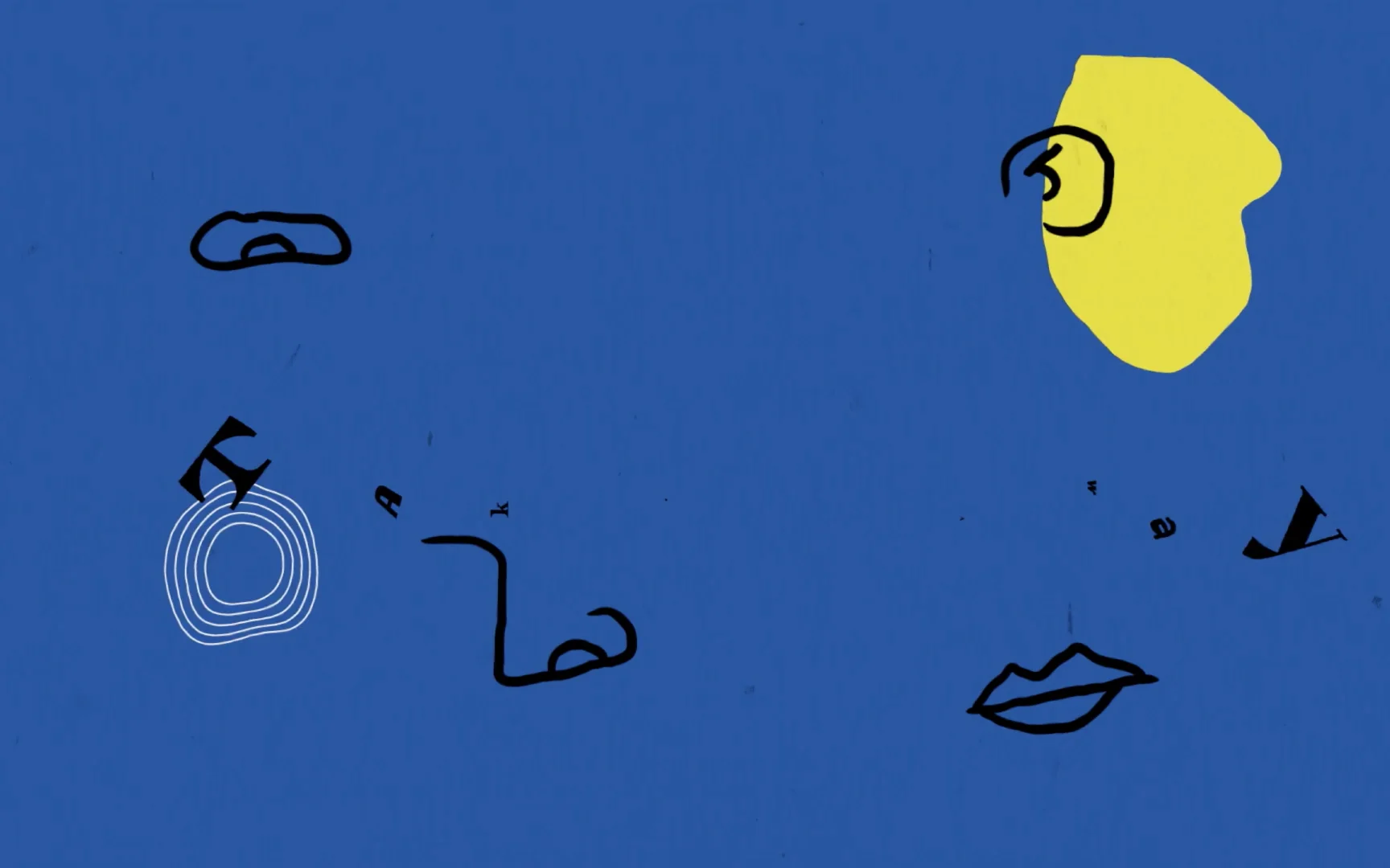
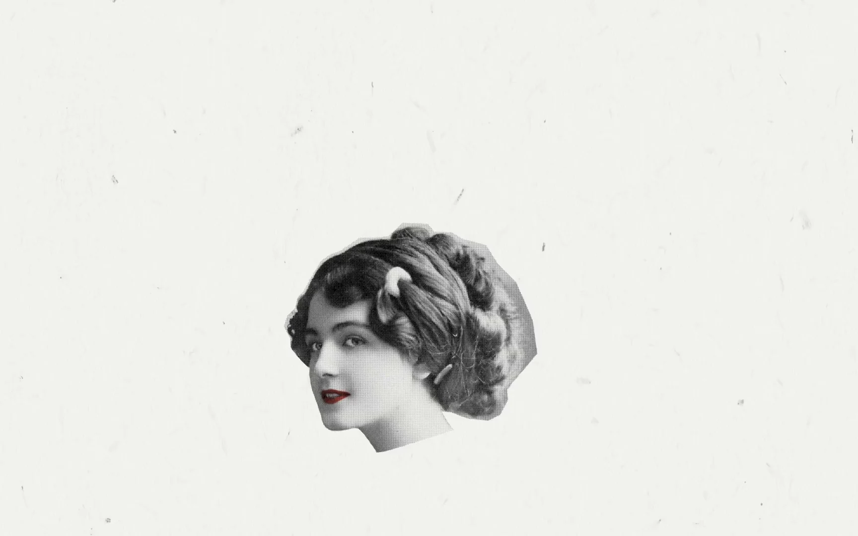
To tell these stories in a way that was conducive to the subject matter, we defined a bold, graphic style with saturated colors that could be used throughout the series with subtle variations on a theme. This style dovetailed nicely with MailChimp's rebrand which featured hand-crafted illustrations paired with bold colors. To add even more personality we incorporated treated, retro photography to illustrate characters and props in each segment. The result was an informative, light-hearted and easy-to-watch video series reminding us all it's not only ok to fail, it might be the best thing that ever happened to you.

