Uber Brand
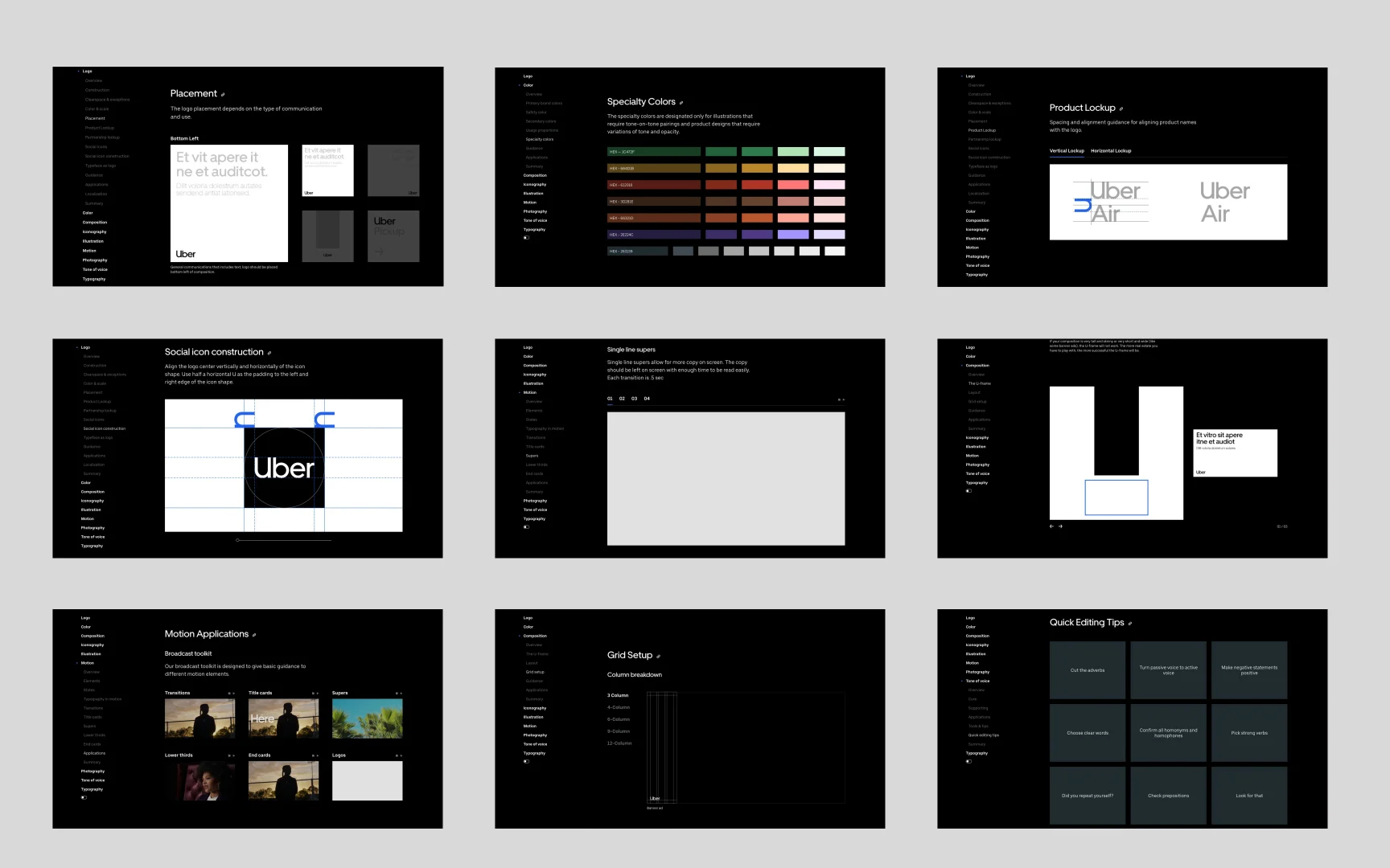
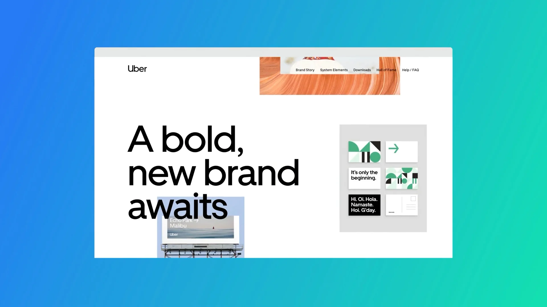
With the recent unveiling of their new brand, Uber asked us to create a site that would present their new identity to the world, showcase all the work being created around the globe, and at the same time serve up guidelines and provide access to assets.
Live SiteThe new U
Presenting the brand in a unique way
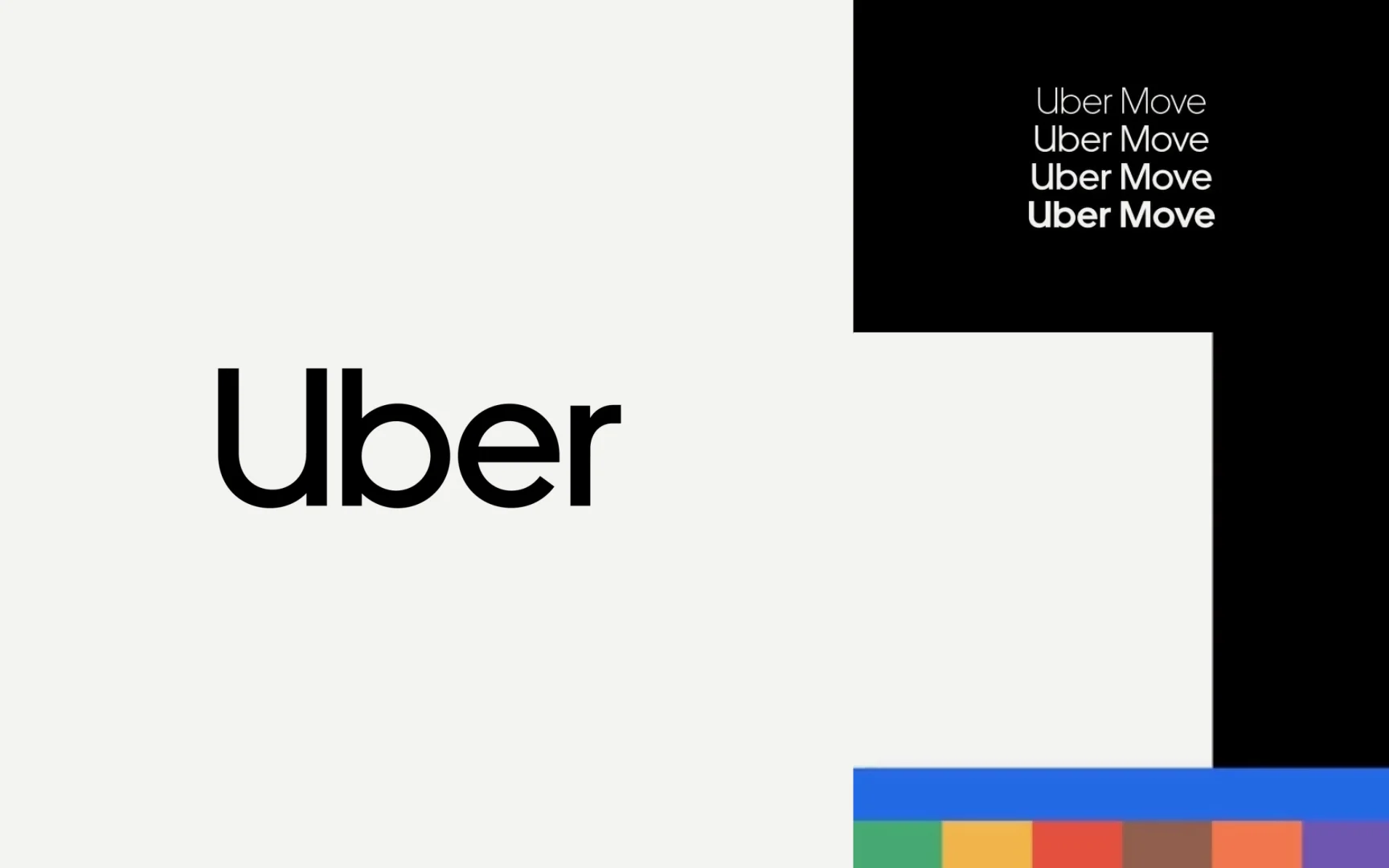
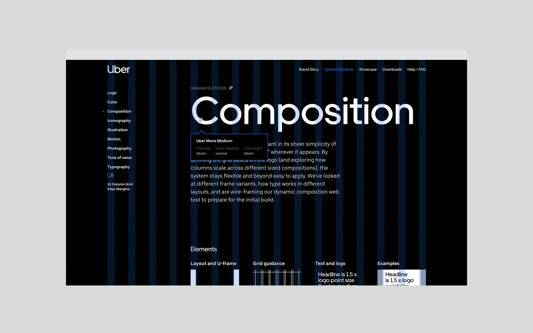
One of Uber's newfound pillars was to bring back the U so we naturally made that one of our jumping off points. By considering its detailed guidelines, we created a grid system that used the U to its full potential. There was an abundant amount of information which required us to go with a clean and modern aesthetic for the overall look.
Interaction
Guidelines you can see and touch
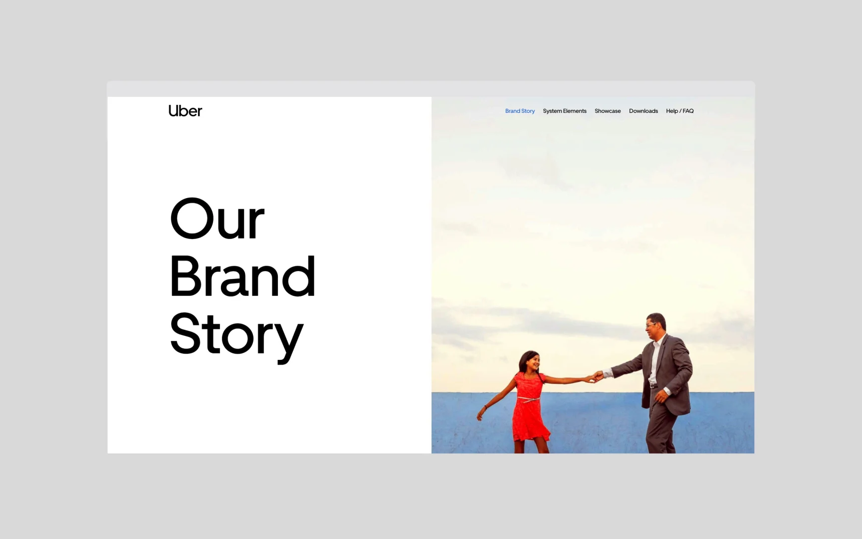
The biggest feat was to showcase the new brand in a seamless, exciting, and easy to share way. Using simple tricks like hovers and click-and-drags, we were able to show the brand and its changes through a new lens and created a user-friendly experience that everyone can enjoy.
